AR6 is the synthesis report for the sixth climate change assessment. We kind of know what we need to do, and what we are actually doing is too little and almost too late. That hasn’t changed from the last set of reports. I’ll try to up my graphics game a bit and discuss a couple of the IPCC’s fancy graphics.
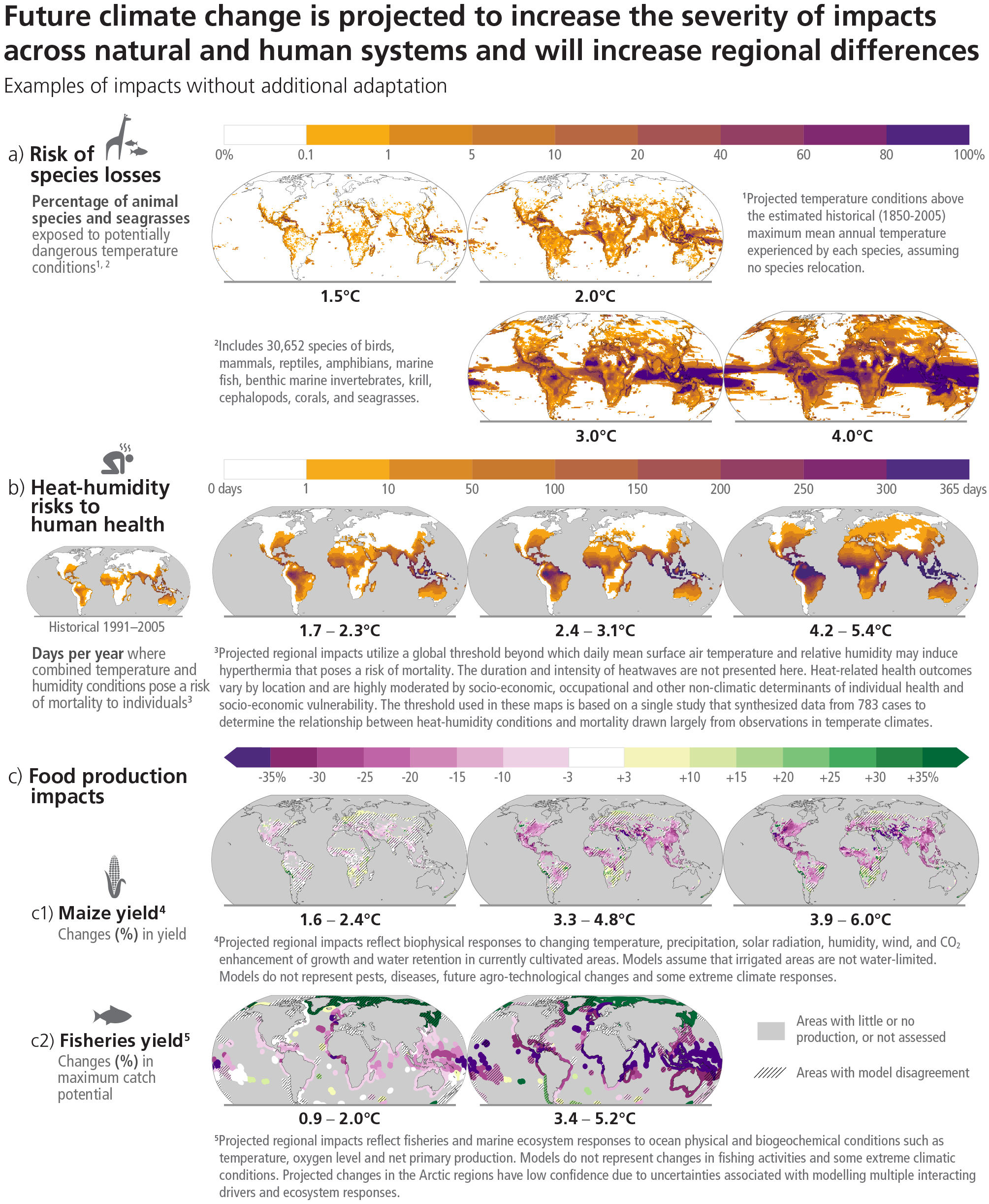
Food and flooding. I’ve been thinking these might be the two elevator pitches to convince ordinary people that climate change is coming for all of us. Floods are coming for our houses whether we live in coastal areas impacted by sea level rise or inland areas impacted by intense storm. Everybody eats food. There are more mouths to feed all the time, heat depresses grain yields, and at the same time we are being flooded we have less water from snow, glaciers, and overpumped groundwater to irrigate our crops. Fire is also an issue.
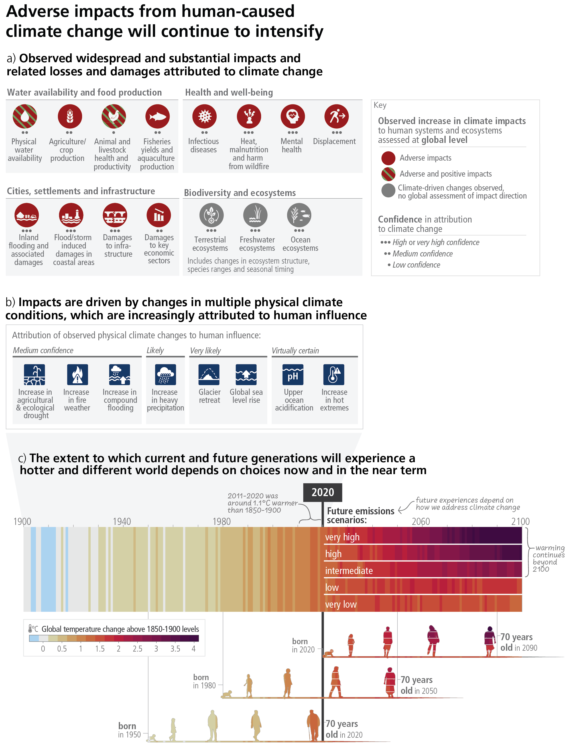
In this (overcomplicated?) graphic, IPCC says that scientists have medium confidence physical water scarcity is already affecting us, medium confidence that crop production is already affecting us, high confidence that inland and coastal flooding are already affecting us, and high confidence that displacement is already resulting. Biodiversity and ecosystems? Forget about it.

You have to quint or zoom in, but the overcomplicated infographic below gives you an idea where and how much heat is expected to depress grain yields. We might be able to grow more in parts of Russia, Africa, and South America, but if we get over 3 degrees C warming the impacts on North America, India and Southeast Asia are concerning.

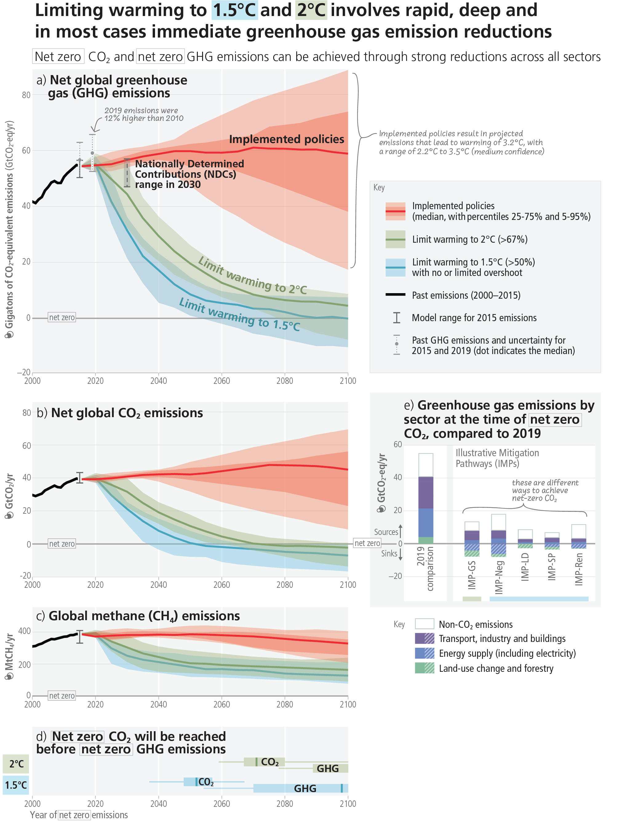
Finally, the time series graphs below make a very clear case that although emissions might have leveled off, the world is not on a trajectory to make the magnitude of emission cuts needed to limit warming to 2 degrees C or less.
